This article offers a clear, fact-based overview of the World Cup 2026 branding. We use official FIFA statements, design studio insights, and reports from outlets like The Guardian, BBC Sport, ESPN, and Design Week.
We include commentary from industry sources like Creative Review and Brand New when relevant.
Publicités
Readers will get a clear look at the FIFA 2026 logo et l'ensemble World Cup visual identity. The focus is on practical advice for broadcasters, rights holders, and merchandise teams. Designers responsible for applying the official branding across platforms and venues will also benefit.
The article covers the official logo reveal, brand guidelines, host-city visual themes, color systems, and accessibilité. It ends with reception and expert opinions. Each section shows what to use, avoid, and how the identity should appear in broadcast graphics, stadiums, and licensed products.
Publicités
Language is direct and focuses on decisions. We avoid exaggeration and unverified claims. Our goal is to provide quick, reliable information about World Cup 2026 branding, le FIFA 2026 logo, and how the visual identity shapes official branding choices.
Points clés à retenir
- Official branding details come from FIFA releases and lead design partners; use those assets first.
- Le FIFA 2026 logo anchors the tournament identity across broadcast, merchandise, and city campaigns.
- Host-city visuals will add local motifs but must follow brand guidelines for consistency.
- Color palette and accessibilité rules are key for readable on-screen graphics and stadium signage.
- Watch trusted industry coverage and design commentary for updates and implementation tips.
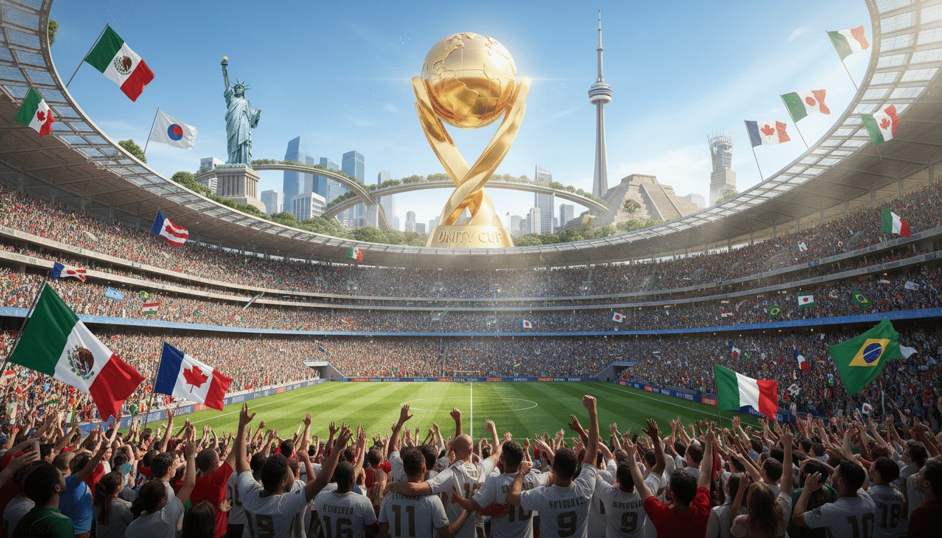
Official FIFA 2026 logo: reveal, elements, and symbolism
The FIFA 2026 logo was launched in a special event for global and regional audiences. FIFA set a main reveal date and then rolled out the logo locally in the United States, Canada, and Mexico. Press materials named the FIFA creative team and partners, setting clear goals to unify three hosts and ensure visibility in broadcasts and stadiums.
Logo reveal timeline and FIFA creative process
The project started with concept sketches and moved through reviews with FIFA and local committees. Designers focused on scaling the logo for digital and merchandise use. Meetings gathered feedback from broadcasters and venue teams to address technical needs before formal approval and trademark filings.
Key visual elements: shapes, typography, and motifs
The main mark combines a circular emblem with subtle map and trophy ideas. Secondary marks include simpler versions and a horizontal wordmark. Typography uses a geometric, condensed style for tight lockups and easy reading on mobile devices.
Symbolism behind colors and forms
Colors reflect the three host countries as clearly stated. The shapes suggest motion, connection, and the new 48-team tournament format. Designers created modular graphics based on host-city art, avoiding cultural symbols without approval.
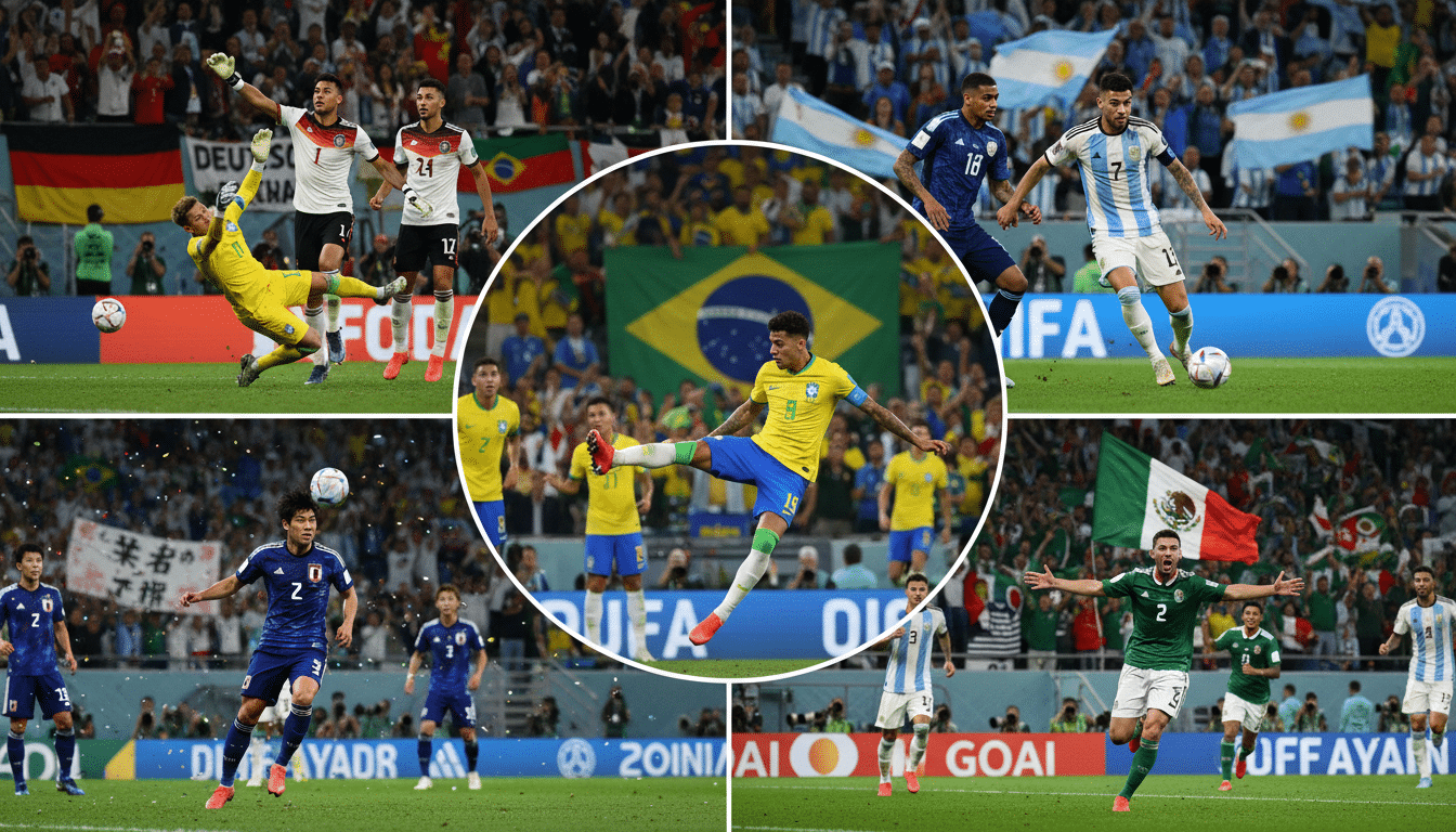
Initial public and media reactions to the logo
Reactions varied between praise for clarity and comments on minimalism. Social media showed quick engagement and debate. Design outlets reviewed the logo’s legibility and originality, comparing it to past tournaments.
Press covered both support and criticism, fueling wider discussion about the logo. Journalists noted disputes over ownership and visual similarity. FIFA answered questions with trademark clarifications and usage guidance after the reveal.
World Cup 2026 branding
Le World Cup 2026 branding is a complete visual system. It includes logo, typography, color palette, photographic style, motion design, and city marks. This system shows the scale of a 48-team tournament across three host countries and allows local expression.
How the main keyword ties into the tournament identity
The identity connects global reach with local flavor. Broad assets create a unified look for broadcasters and sponsors. Localized marks let Miami, Vancouver, and Mexican host cities add cultural details.
Stakeholders use the World Cup 2026 branding to keep consistency across stadium graphics, broadcast packages, and city campaigns.
Brand guidelines: consistent use across platforms
The official brand manual sets clear rules. It defines logo usage, clearspace, minimum size, and prohibited treatments. Color specs include Pantone, CMYK, RGB, and HEX.
Imagery rules guide composition and tone for hero photos and social cards. Platform rules direct applications like broadcast lower-thirds, social templates, merchandise tags, and stadium wayfinding.
Licensing agreements and trademark monitoring enforce compliance. Third-party approvals follow a documented workflow.
Integration with FIFA design system and official look
The identity works with legacy FIFA toolkits for digital and broadcast needs. On-screen graphics must transition smoothly to stadium LED and mobile apps. Responsive SVGs and motion guidelines avoid clutter and keep legibility on small screens.
Assets include accessibilité notes. Contrast ratios, alt text guidance, and screen-reader friendly markup are included. This keeps on-air and online presentations consistent with FIFA’s design system and accessibility standards.
Implications for official merchandise design and licensing
Brand rules shape merchandise. Allowed logo versions, approved colorways, and patch placement on kits are specified. Special editions tied to host-city themes follow the same approval steps as standard products.
Licensees must submit mockups for review. FIFA sets quality standards for materials and manufacturing. Commercial terms cover co-branding, royalties, and anti-counterfeiting measures like unique tags or holograms.
These controls protect official merchandise integrity while supporting revenue partnerships.
Host city designs and localized visual themes
Le host city designs program gives each venue a local voice while keeping the global mark intact. FIFA allows city-level identities that add to the official system. The goals are to celebrate local culture, provide assets for tickets and signs, and enhance tourism messaging without harming the tournament look.
Art Deco Miami: approach and examples in city branding
Art Deco Miami uses geometric shapes, pastel colors, and neon lights from Miami Beach architecture. Designers apply streamlined fonts and repeated patterns that mimic building façades. You see these on stadium banners, transit wraps, hospitality zones, and city signs referencing Collins Avenue.
Local studios like city design offices work with cultural groups to turn heritage into useful graphics. These partnerships make consistent designs for merchandise and fan zones while keeping a modern city vibe.
Vancouver indigenous art: collaboration and meaning
Vancouver indigenous art involves community talks and legal agreements with Indigenous councils. Projects focus on rights, credits, and fair use when using motifs. Coast Salish and other local styles appear in ceremonies and event graphics.
Design teams care about cultural respect. They add revenue-sharing and clear credits. Museums and community materials use these patterns to create meaningful, local experiences for visitors.
Mexican Aztec patterns branding: heritage in modern design
Aztec pattern branding turns pre-Hispanic shapes into modern designs. Bright color contrasts and repeated patterns appear on fan gear, stadium interiors, and printed programs. Designers keep motif integrity with clear typography and digital scaling.
Collaborations often include Mexican cultural groups to avoid misuse. This step keeps heritage authentic while meeting broadcasting and sales needs.
How host city designs feed into the tournament aesthetic
City branding assets fit into a modular system used in ticketing, transit, and sponsor events. This system lets each city show local identity but still matches the World Cup look. Approval steps ensure brand rules and consistency.
Local themes create unique fan experiences at each venue. They form small campaigns that feel part of one overall tournament style. The result is varied city stories that still feel like one event.
World Cup colors, palette choices, and application
The branding palette guides every visual touchpoint. It sets the tone and ensures clarity on screens and in stadiums. This helps keep a cohesive World Cup visual identity sur toutes les plateformes.
Below, we explain technical values, accessibility rules, and practical uses for both broadcast and urban settings.
Primary palette
- FIFA Blue — Pantone 286 C; CMYK 100,66,0,2; RGB 0,51,160; HEX #0033A0.
- Gold Accent — Pantone 123 C; CMYK 0,24,94,0; RGB 255,199,44; HEX #FFC72C.
- Neutral Night — Pantone Cool Gray 11 C; CMYK 0,2,6,60; RGB 77,76,82; HEX #4D4C52.
Secondary and host-city accents
- Coastal Teal for Miami variants — CMYK 85,0,30,0; RGB 0,160,153; HEX #00A099.
- Maple Red for Toronto/Vancouver touches — CMYK 0,90,75,10; RGB 200,16,46; HEX #C8102E.
- Sunset Orange for Mexico City elements — CMYK 0,55,95,0; RGB 255,115,0; HEX #FF7300.
Rationale
Primary colors aim for strong visibility on HD and 4K feeds. Blue anchors the identity. Gold signals prestige and trophies.
Neutrals control legibility for text and data. Host-city accents show cultural respect while keeping palette choices consistent for brand coherence.
Accessibility and contrast
- Text over colored backgrounds must meet WCAG AA minimum of 4.5:1 for normal text and 3:1 for large text.
- UI elements use high-contrast states for mobile. Buttons and icons switch to full-contrast outlines in low-light or outdoor modes.
- Designers validate color-blind friendliness with Daltonize and Coblis tests. Combinations avoid red/green reliance for critical signals.
Digital and mobile adaptations
Gradients simplify on small screens to flat tones. Icons use thicker strokes and negative space. Broadcast graphics use scalable SVGs to keep color fidelity on all devices.
Broadcast graphics application
- Score bars use FIFA Blue base with Gold Accent highlights for scores and timers.
- Lower-thirds and stat cards use Neutral Night for text blocks to keep numbers readable under different camera exposures.
- Sponsor separation uses translucent overlays and fixed color bands. This avoids visual clash and respects partner marks.
Stadium and on-site use
- LED perimeter boards use saturated primary colors tuned for broadcast cameras. This avoids flicker and color shifts under stadium lighting.
- Wayfinding relies on high-contrast pairs and large pictograms for quick reading by mobile users.
- Seating overlays and pitch-side elements use matte finishes where possible to reduce glare on TV.
Urban and print production
- Billboards and transit wraps use CMYK values with expanded gamut proofs. These match Pantone references in large format printing.
- Public art installations let host-city accents lead while primary palette maintains the World Cup visual identity.
- Color management files and vendor specs are needed for fidelity across materials and vendors.
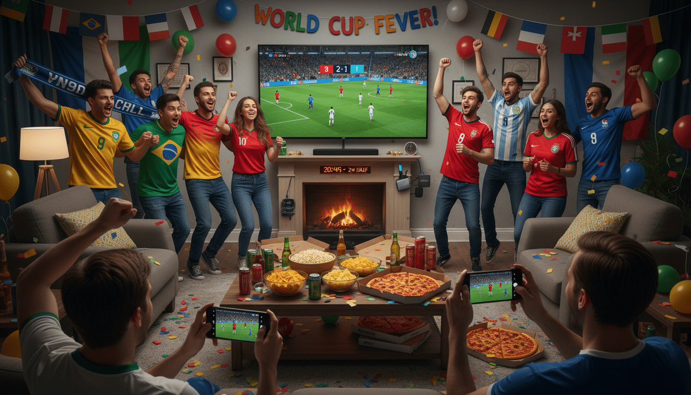
Reception, controversies, and industry perspectives
Le 2026 logo reaction varied across platforms. Fans on Twitter/X and Instagram praised its clarity and adaptability for broadcast. Other users on fan forums called the mark safe and predictable.
Major outlets noted easy legibility on small screens. They also shared mixed views on the logo’s originality.
Fan sentiment split between appreciation for accessibility and disappointment in boldness. Designers praised the system for scalability. They liked its flexible use across host cities.
Media responses focused on how the mark works in live graphics and social feeds.
Trademark and cultural debates emerged soon after the reveal. Reports showed opposition filings and public questions about using indigenous motifs in some local designs. FIFA stated it had taken consultation steps. Legal teams reviewed filings related to merchandising and licensing.
Where intellectual property claims affected rollout, broadcasters delayed some licensed items. Organizers changed local artwork credits. They also published extra notes to address cultural sourcing concerns.
Branding professionals in Creative Review and Design Week gave practical critiques. They praised strong typographic choices. They also noted the need for tested motion assets. These experts warned about challenges when scaling the system across stadiums and cities.
- What worked: clear scale hierarchy and consistent color rules.
- What could improve: distinct local voice without breaking consistency.
- Recommendations for licensees: test color contrast on LED boards and confirm safe-space rules for overlays.
Predicting the effect on tournament identity requires care. The flexible system may age well if tightly managed. But it risks seeming generic if local stories are lost by over-standardization.
Long-term benefits for host cities include boosting cultural tourism. This can happen through well-documented collaborations. Stakeholders should get approvals early and test assets in live environments. They must document artist partnerships to protect cultural integrity and brand clarity.
Conclusion
The World Cup 2026 branding aims to create a clear tournament identity. It balances a unified global look with local flavor. The official branding combines simple forms, deliberate colors, and easy-to-read typography.
These design choices work well on mobile screens, broadcasts, and stadiums. Brand guidelines et le FIFA design system keep the identity consistent and legible everywhere.
Host-city themes add to the system without breaking it. Miami’s Art Deco, Vancouver’s Indigenous art, and Mexico’s Aztec motifs layer local style on the core identity.
Accessibility, contrast, and color are essential when adapting local designs for screens and signs. These priorities must never be compromised.
Next steps are clear for all involved. Broadcasters should use official assets following brand rules. They must test for readability on mobiles and stadium cameras.
Merchandisers and licensees need to submit mockups early. They must follow the approved colors and logo rules carefully. City partners and cultural groups should document their work, secure rights, and align with the FIFA design system.
Overall, the World Cup 2026 branding unifies and guides all efforts. Follow the guidelines closely and ensure clear, respectful use. Focus on fast, reliable delivery so fans enjoy matches with ease.
This approach creates a strong tournament identity. It respects local expression and works well in media and retail settings.
Contenu créé à l'aide de l'intelligence artificielle.